Translate

Wednesday 10 June 2015

Exhibition Space - Artists


Wolfgang Tillmans 


This is one of the ways Wolfgang Tillmans has presented his exhibition, he chooses different sized for the images because it depends on what the subject matter is he approaches his work with a democratic eye and a singular style that rejects the traditional hierarchy of subject matter. 
His photographs present casual views of people caught at their most unguarded moments and moneys in everyday life.
Tillman's work challenges traditional photography, mixing framed and unframed photography in his exhibitions. He decided how the individual image is presented by its content. 
These compositions span over entire walls and galleries, incorporating clusters of ink-jet prints and C-print photographs that vary in size.


Cornelia Parker


Cold Dark Matter
This piece came out of a series of works Parker was doing about cartoon deaths - things like: things falling off cliffs, things being run over by a steam roller, things being blown up, shot full of bullets, like roadrunner or Tom and Jerry.
The garden shed came about because I was trying to find something universal and archetypal and that we all identified with and that was familiar to us. It's not the house but it's this kind of attic-y private place at the bottom of the garden which we put all our left-over stuff in. And so it seemed like a depository rather than the place that you live. We took it out to the Banbury Army School of Ammunition, to their demolition grounds where they do all these experiments with explosives and they were really keen to blow it up. I actually pressed the button that detonated it.


Heart of Darkness


Tuesday 9 June 2015

Concept Of Idea

The concept of my art, started off being about Batman and Gotham City and how it is over run by evil people and criminals and how Batman is the one that is trying to protect the city from them. I am able to link it to what is happening in the world today.

The photographs that I used in my final posters had been taken in Portsmouth and London which are both at the moment facing crimes such as teenagers and children deciding to leave and go and fight in Syria. I chose to include the e images in my final piece so as to show that crime is still a big thing in both of these cities and across the whole of the world.
To compare it to Gotham there isn't a superhero / Protecter like Batman in the real word  that is trying to stop these things from happening. 

Here are some Statistics into All Crime for Portsmouth and London: 

London

(12 months to April 2015) - 709,361
(12 months to April 2014) - 698,753

Portsmouth

(12 months to April 2015) - 17,954
(12 months to April 2014) - 16,924


Most well known Crimes and Criminals in London throughout the years:


Jack the Ripper

Jack the Ripper is the best known name given to an unidentified serial killer or killers active in the largely impoverished areas in and around the Whitechapel district of London in 1888.

Attacks ascribed to Jack the Ripper typically involved female prostitutes who loves and worked in the slums in London. The removal of internal organs from at least three of the victims led to proposals that their killer possessed anatomical or surgical knowledge.   
The large number of attacks against women in the East End during this era adds uncertainty to how many victims were killed by the same person. Eleven separate murders, stretching from 3 April 1888 to 13 February 1891, were included in a London Metropolitan Police Service investigation, and were collectively known as the "Whitechapel murders". 
Opinions vary as to whether these murders should be linked to the same culprit, but five of the eleven Whitechapel murders, known as the "canonical five", are widely believed to be the work of Jack the Ripper. 
Most experts point to deep throat slashes, abdominal and genital-area mutilation, removal of internal organs, and progressive facial mutilations as the distinctive features of the Ripper's modus operandi - (method of operation) The first two cases in the Whitechapel murders file, those of Emma Elizabeth Smith and Martha Tabram, are not included in the canonical five.


The Kray Twins 

Twin brothers Ronald "Ronnie" Kray (24 October 1933 – 17 March 1995) and Reginald "Reggie" Kray (24 October 1933 – 1 October 2000) were English gangsters who were the foremost perpetrators of organised crime in the East End of London during the 1950s and 1960s, with their gang, "The Firm", the Krays were involved in armed robberies, arson, protection rackets, assaults, and the murders of Jack "The Hat" McVitie and George Cornell.
Their criminal records and dishonourable discharges ended their boxing careers, and the brothers turned to crime full-time. 
They bought a run-down snooker club in Bethnal Green, where they started several protection rackets. By the end of the 1950s, the Krays were involved in hijacking, armed robbery and arson, through which they acquired other clubs and properties. In 1960 Ronnie Kray was imprisoned for 18 months for running a protection racket and related threats. While he was in prison, Peter Rachman, head of a violent landlord operation, gave Reggie a nightclub called Esmeralda's Barn on the Knightsbridge end of Wilton Place next to Joan's Kitchen, a bistro. The location is where the Berkeley Hotel now stands, on the corner opposite the church.

 In fact Jack D McVitie was also known as a notorious English criminal from London of the 1950s – 1960s. He is posthumously famous for triggering the imprisonment and downfall of the Kray twins. He had acted as an enforcer and hitman with links to "the firm", and was murdered by Reggie Kray in 1967.


Alternative Presentation Ideas

Here is one of the options I could have done for my final piece, this is framed.
This could have been an option because it looks like professional.
Its nice to have the thick black border around the edge of the piece.
But the other option is to have a frame that doesn't really have a border and makes the piece look as though it is floating.
For my posters i would have preferred to have the frame that doesn't have as much border because my piece has enough black in it that it doesn't need a massive outline.


This chose is a bit more contemporary due to it being hung up on string and then just pinned. I like the idea of this because it shows a more laid back look to the work and feel that the work looks more appealing to view.
It also allows you to chose different sized images within the whole piece without it looking out of place.

Final Jokers - Step By Step


The first thing I had to make sure was that my page was the same size as what I wanted it to be printed which is A2, otherwise the images would be on a smaller file so when i took it to be printed it would have stretched out and would start to become blurry and pixelated.
 
To start my first final poster I opened up the edited photo of myself in photoshop.
The first thing I needed to do was remove the background.
To do this I first used the quick selection tool, and highlighted the areas that I wanted to keep.


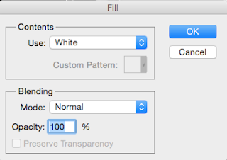
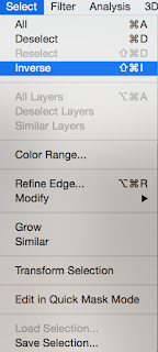
   Then I choose 'Select' than 'Inverse'

After that you press the backspace and chose the white fill and press okay.


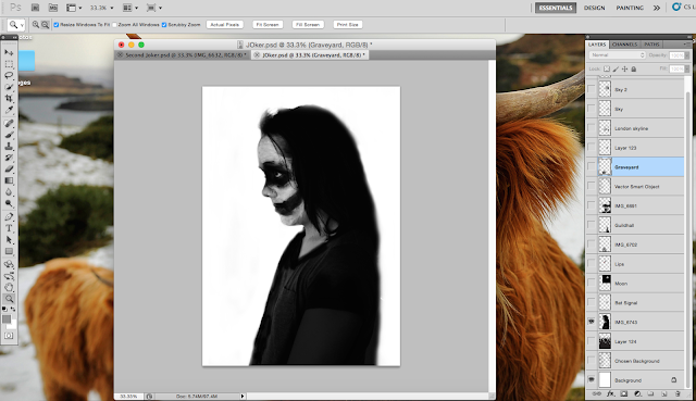
It ends up looking like this. To get rid of the ants you do cmd d.

The edges are still a little to sharp so I just use the rubber tool on the soft round brush so as to make the edges more soft.

what I also had to do was to make the bottom half of the image is harder so that the next layer of images that go over the top will be the only thing that is seen rather than the arm.


This is how it turned out. It is now ready to start adding the next layer of images.


The first image I chose to place in this silhouette is the London skyline. To do that I went to file then 'Place...' and chose the file. I then stretched it out so it would fit the shape.  

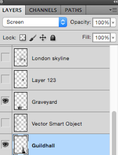
For each image I changed the side drop down box option from 'Normal' to 'Screen' this allows the images to seem as though they are better fitted around the background image.


I then added the next image which was taken in Portsmouth of the Guildhall.
This is when I had to start removing some of the other image so that you are able to see both of them, to do that I used the rubber tool with the soft round brush.

  I just rubbed away from from the London skyline the parts that where covering the guildhall.


The next image was the graveyard, this filled up the rest of the space that was free from a photo.
I did the exact same thing to this photo as with the previous.


The next thing to do was to add the sky parts, luckily i had already had the start of a sky from the London skyline photograph and would be easier to blend in.
when i had been out taking photos of London and Portsmouth I also was able to take some sky shots, one with birds and some with clouds. This is what I am going to use to make the extended sky.


After I had added all of the clouds I realised that it was really black and white so decided to add a small amount if colour into the piece. As I have created this piece in the light of Batman and had painted my face like the Joker I decided the best place to put the colour was the lips.

To do this I took the original image of the portrait, which is colour and placed it over the top of the black and white one put the drop down box to 'Screen' so you can see the other images underneath. Then just like the previous images i rubbed away all of the parts that where unwanted just to leave the lips.

 This is how it looks after taking all of the other colour away.
I felt that this colour was a bit to bright and stands out to much so I decided to change the fill.


This is the final design choose i feel that the lips are subtle enough to go with the rest of the piece but to still stand out enough to be noticed.

The next thing I needed to add to this design was the background.


As this piece is linked to the theme of Batman I felt that it was laking that link so designed my own bat signal to put within the buildings.


This I had been happy with, but still felt that it was laking one more thing.

That is when I decided to a moon in at the top of the sky yo show that i wanted it to look like a nighttime scene.

To make the moon I just did the exact same thing as the previous images used in this piece, by erasing the part of the image I didn't want.


Posters With Text


Here I have decided to experiment with different ways to change my final posters, one of them being text.

With this poster I have decide to add the word 'Batman' this I then diluted the fill to 40% and placed it at the bottom of the poster, similar to Olly Moss I chose to do white text on black background so then you wouldn't miss it.


What I thought next was how could i link both of my poster together more and then realised that i could add some text onto the top half of the second poster so that it became a sentence / title to follow through the pieces.

I think the idea of it has worked really well but don't feel that it looks as nice with the text as it does without.
That is why in the end I chose to create my posters without any extra text because I felt it took away from the pieces.

Different Composition - Final Posters

With this composition i had based my images to be all about London and the buildings and bridges, to my eye Id say that this piece was a bit to busy, that the images don't blend as well together as they should like my final choices that had been made so the image looked like it was one rather than five put together.

This one I decided that to focus on using photos that only included buildings / architecture. This has not turned out as bad as the last chose but i still feel that they look as though they are bumping against each other rather than comfortably positioned together.


With this composition I chose one of the really nice images of an old building that has a lot of detail and placed it at the bottom part of the piece so it is the largest image of the set and becomes the focal point.

What I like more about my final chose is that i have included more than three images in the final poster, this example only features two main images so doesn't look as interesting and have a lot of chooses to look at.

Exhibition


Here is what my work ended up looking like displayed, I am really happy with the end result and like that it looks really professional finished.
I also decided to randomly chose some other peoples work that was also displayed in the show.
Showing how different pieces of work where mounted in different ways.
 I really like this composition because it has a selection of different  sized images. My favourite set is the nine on the left.

Colour Poster Experimetns

Here I have decided to experiment with different way my final posters could look with this lot I have looked at Colour photos with black and white touches.

This is the first one I decided to create, being an experiment but also a response to the designer Olly Moss. what i have chose to do is make all of the images inside the torso of a orange tone colour this likes to Olly Moss' pieces because for the posters I look into he chooses the same colour palette of orange for the posters even though they had different subject matters that looks as though they where in a set.
Olly Moss


Here are some other alternative designs. With both of the posters on the left and the right, I have chose to do experiment with having only one image out of all of them colour. This I really like as that image becomes the focal point of the piece.
I perforate one on the right because it is not to much like the one on the left, it fits in well with the rest of the piece unlike then on the left.


Monday 8 June 2015

History of Film Posters

The earliest forms of advertising for movies included hand painted crates and sandwich boards. The turn of the 20th Century saw a world with a very high illiteracy rate. Posters or advertising for any entertainment needed to have vibrant colors and pictures and a limited amount of words, so that the advertising could be appreciated by a large number of people.

Movie posters are the bait that lures you into the theater. Motion pictures began more than 100 years ago, and today it is a multi-billion dollar industry. Movies and movie posters go hand in hand in helping the public identify their favorite films and stars.

At first, movies used advertising paper sizes from vaudeville, fairs, and the circus. With the growth of movie theaters, there was a need for more specialized sizes. This was when they created inserts and lobby cards.
In the early days of film, there were no movie stars on movie posters because most actors in film chose to be anonymous. The producers were thrilled, because they believed they could control the medium as long as there were no stars.
By 1910, the studios began to receive mail addressed to these nameless actors. The public demanded to know the names of the actors and actresses.
Producers soon realized that they could make much more money by acknowledging the stars that would bring the people into the theater, and so posters changed. Posters at this point reflected the status of the leading lady and leading man. The public would soon recognize the star status simply by looking at the movie poster. The size and placement of the print told the public just how “big” a particular star was. Actors and actresses took heed of this and started to become more powerful in demanding their due.
With more films being produced and more movie houses being built, another advertising medium became popular – the billboard.

With the growth of the automobile, producers recognized that these billboards could be seen from great distances when traveling in a car. 

The 1920’s were considered the golden age of the silent movie. Beautiful movie palaces replaced the movie theater. The posters of old were replaced by artistically aesthetic movie posters. Well-known artists were commissioned to design movie poster portraits of leading stars. 
The posters of the 1920’s were specifically designed with portraits of the stars, the movie title, and the star’s name. There was an occasional slogan or two, but most of the emphasis was centered on the movie stars.
With the 1930’s came the Great Depression. Many feared that movies would suffer during this time because people would not want to spend their money to go to the movies but the exact opposite happened. The Depression made people want to escape reality, and movies became even more popular.

During the 1940’s, war movies dominated the screen. 

In the late 1940’s, we entered a new arena: the age of television. By this time, TV had attracted a large number of movie goers, so the studios responded by reducing the number of films made

With the coming of the 1950’s, and to fight the popularity of television, movie studios created more fantasy films. The studios that once produced the war movies were now making science fiction, comedy and grade “B” drive-in movies. Although the drive-in had been around since 1933, it reached its peak during the 1950’s with over 4,000 screens in the United States alone. 

The coming of the 1960’s brought the boomer generation to their teen years. There were so many children from the post-war baby boom that a lot of the movies were very “teen” oriented. Teen idols from the world of rock and roll crossed into movie stardom. Elvis Presley became very popular at this time, not only for his music, but his movies. There were also a lot of “beach movies” with Annette Funicello and Frankie Avalon. Action movies also became very popular and we saw the introduction of the infamous double agent, 007, James Bond.

The 1970’s was actually a launching pad to the era of the blockbusters of the 1980’s. Movies like The Godfather, Rocky, Star Wars and Star Trek were born. Although the posters of this time continued the use of photography, drawing and painting styles were sometimes used.

The 1980’s was the age of special effects, which was the key to the success of The Empire Strikes Back, Raiders of the Lost Ark, Return of the Jedi, Back to the Future, Batman, ET, Ghostbusters and Who Framed Roger Rabbit.

Until the 1980’s, most movie theaters featured only one movie in their theater at a time. All their advertising space was centered on that one movie. With the 1980’s came theaters which featured several movies, and therefore, the lobby advertising had to be divided equally for all the films. As a result, “mini sheet” posters became popular because they could be produced in smaller sizes.
With the 1990’s came the computerization of special effects. Because of this, the 90’s brought two of the biggest money making films in history, Jurassic Park and Batman Forever.